
Responsive Web Design!!
You must be coming across this term repeatedly while planning to get your e-commerce website designed or redesigned. Wondering if it is right for your business? You will get your answer in this post.
Why is responsive ecommerce web design trending?
Do you shop online? Have you ever seen a desktop version of the website when you have to zoom in to view everything? Yes! How was the experience? Not Good!! So, for this reason, a website needs to be responsive. You will lose potential leads and sales if your e-commerce website lacks responsive design.
Do you know half of the website traffic worldwide comes from mobile devices? In the 2022 second quarter, mobile devices generated 58.99% of global website traffic. The number is in itself self-explanatory why you need responsive ecommerce web design. To clarify, we will discuss the pros and cons of using responsive designs.
But before that….
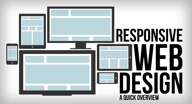
What is responsive web design?
A single site with one URL and flexible layout that adjusts as per the user’s screen is a responsive design. It lets the website load quickly on users’ screens, eliminating the need to manually resize the content by zooming in or out.
Responsive design will make your website look awesome on different screens – tablet, desktop, mobile, etc. The main goal behind it is to give an optimal experience to the users.
Basic design elements of responsive web design:
- Eliminates the need for horizontal scrolling
- Readable size text without zoom-in or zoom-out
- Optimized images for quick loading
- Link and buttons at adequate space to make tapping easier
Now that you know what responsive design is, let’s see the pros and cons of designing a responsive website for e-commerce.
Pros of responsive ecommerce web design
Responsive design is vital for your business and accompanies a lot of benefits: Here are the top ones:
1. User-friendly experience
Whether a user accesses the website from a desktop, tablet, mobile, TV, etc., it must adapt the device screen completely. It improves readability and increases users’ chances of spending more time on a particular website. If you are successful in this, you are providing a user-friendly experience to your potential customers.
2. Saves Cost
Responsive designs eliminate the need to develop multiple websites compatible with different devices. It saves time, energy, and cost as you only have to create and maintain a single website.
3. Consistent Experience
Responsive web design involves the usage of the same content across multiple platforms. It gives users a consistent experience. For instance, a user is reading about – certain things to consider while buying a luxury watch. They read half of the blog on their PC and want to read the remaining on their phone while on the go. Now, if the website is responsive, they will see a consistent page on both devices, giving them the best experience.
4. Improves Visibility
It does not matter how beautiful your website design is. If it is not responsive, the whole effort goes waste, as it will not appear in the ranking. Do you know responsiveness is an essential factor in the ranking? Google likes responsive websites and ranks them higher in search engines.
5. More Social Shares
Users feel more engaged with a responsive website and share it more on social media. It is not going to improve your ranking, but will surely make you reach a wider audience. More social traffic means more customers for your business.
Cons of responsive ecommerce web design
Sometimes designers overlook the important features to accommodate the content on the small screen for avoiding long scrolling. It is also not a good web designing tactic. You need to plan the content and images tactfully. Though responsive design is the need of the hour, certain cons are linked to it if not done correctly. Here are they:
1. Time consuming
It is time-consuming and highly challenging if you already have a website and are considering converting it into a responsive web design. The wise action would be to get it redesigned from scratch.
2. Slow page loading speed
If the images are not well-optimized in the responsive website, it will affect the website page-loading speed. So, resizing the images and well-optimizing other graphics used on the website without affecting the quality is essential.
3. Tough navigation
Responsive web design is done to make it fit the small screen. Sometimes it becomes challenging to make a more extensive website fit the small screen, making navigation tricky. You need to plan the content strategically to make navigation easier without skipping adding essential features.
Final Words
Responsive designs already exist and are going to stay forever. It is so because today, in comparison to desktops, users access the internet more on tablets and most on their mobile devices. Responsive web design is the only solution to capture the user’s attention during their changing behaviour. If your business lacks responsive design, it’s high time to redesign your website.
Boost engagement and improve your website ranking by getting responsive ecommerce web design!


